At a glance
Context
- Data engineering internship at Swiss Life Banque Privée, from April to August 2025.
- Management of the MOE (IT delivery) team and of Release Management.
- Need for centralised reporting and reliable KPIs to monitor activity.
Actions
- Writing the specifications and planning with the V-model.
- Collecting and processing data from Tabsters and SQL Server.
- Building an ETL pipeline with Microsoft Fabric, Python (Pandas, NumPy, Spark, DeltaTable) and a Lakehouse.
- Developing Power BI dashboards: capacity tracking, individual activity, workload distribution, skills, KPIs and history.
Results
- Centralised reporting and KPIs for managing the MOE team and Release Management.
Architecture
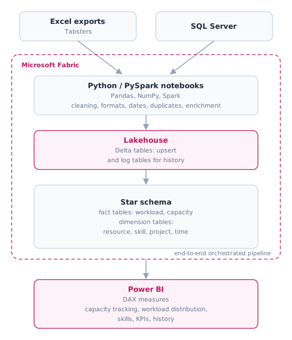
Technologies used
During my internship, I worked with several technologies for IT management and reporting:
- Python & PySpark: ETL processing, DataFrames and Delta Lake.
- SQL / Delta SQL: creating tables in the Lakehouse and keeping their history.
- Pandas / NumPy: data manipulation and transformation.
- Power BI: building reports and dashboards.
- DAX: advanced calculations for analytical reporting.
- Excel: data source and extraction into the Lakehouse.
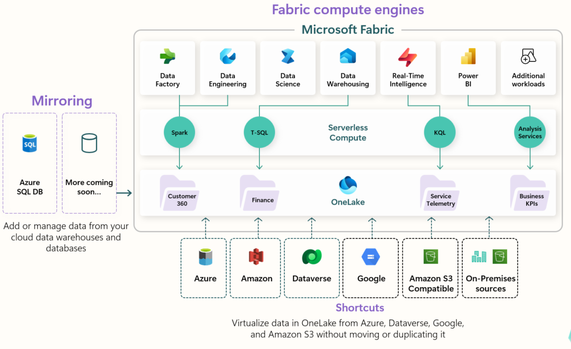
- Fabric: a new, complete SaaS cloud platform for data and analytics that lets companies collect, store, transform, analyse and visualise their data in a single environment.
Design
Options considered
Two main options were considered for setting up the management reporting:
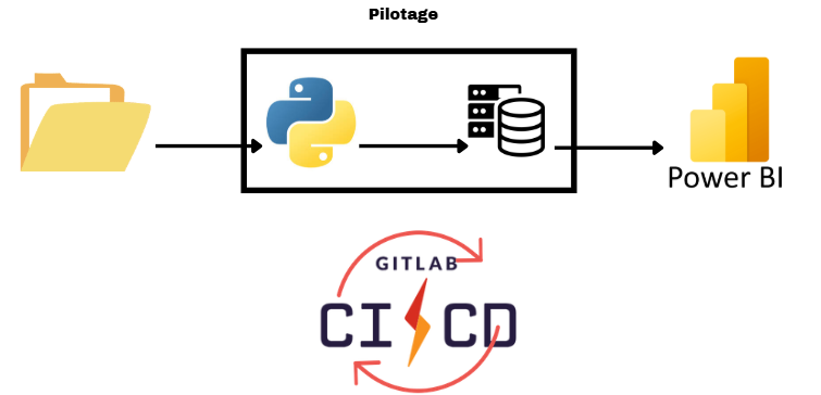
- Extraction and transformation with Python + Power BI
The first option was to use Python to extract and transform the data on an isolated company server, ensuring data security and confidentiality. The results would then be visualised in Power BI, with automation handled by GitLab CI/CD.
However, this option meant a significant cost for the infrastructure team to set up the server and a significant delay before it would be operational.
- Using Microsoft Fabric
The second option relied on Microsoft Fabric, an all-in-one cloud platform. Although the data is stored in the cloud, this is not a problem here, as it contains no confidential information and no customer data.
Fabric makes it possible to orchestrate every step, from extraction to transformation and visualisation, on a single platform. This greatly reduces the number of tools needed and allows fast and efficient implementation of the processing. In addition, the company already used the Microsoft environment, so this platform seemed a natural choice.
Data model
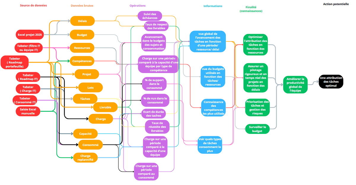
To organise and use the data efficiently, we designed a complete data model for management reporting and Release Management.
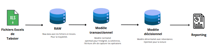
- Planned data flow
The data is extracted from one main source: Excel files from Tabsters.
Extraction: retrieving the raw files from Tabsters.
Transformation / cleaning: standardising formats, parsing dates, handling duplicates and enriching the data (e.g. assigning skills to resources).
Loading: inserting the transformed data into the tables of the final data model.
Visualisation: building dashboards in Power BI.
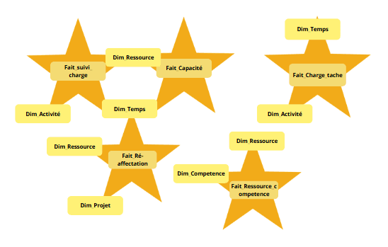
- Star schema
The data model follows a star schema, with:
Fact tables: workload tracking, capacity, etc., containing the main measures.
Dimension tables: resource, skill, project, time, making it easy to filter and aggregate the data.
This structure makes DAX calculations, aggregation and tracking of key indicators by skill, action, project or period easier.
- Staging database
We initially considered creating a staging database to store the cleaned data before loading it into the final model.
Advantages: isolated transformations, better traceability and the ability to rerun processing without touching the source data.
Limitation: given the relatively small data volume in this project, this intermediate layer was not needed, so we simplified the pipeline by loading the transformed data directly into the final tables.
- Final models
Two data models were finally adopted: one for management reporting (workload, capacity, resources, skills, projects) and one for release management. The detailed diagrams are not published, as they describe the company's internal organisation.
Implementation
Overview
The design model was implemented in Fabric, following the star schema defined during the design phase. The model includes the main fact tables for management reporting and their dimension tables, allowing detailed analysis while keeping a readable structure optimised for Power BI.
The data flow was fully orchestrated in Fabric. Source data is extracted, transformed and consolidated directly in the pipeline, so every step can be followed from import to visualisation in Power BI (see the architecture diagram at the top of the page).
Code
Python/PySpark was used to process and transform the data, in particular for its ability to handle large data volumes. Delta Tables were used to enable upsert operations, ensuring that data is reliably updated or inserted.
Example of an upsert into a Delta Table:
from delta.tables import DeltaTable

def upsert_table(spark, df_spark, table_name, join_condition):
    delta_table = DeltaTable.forName(spark, table_name)
    (
        delta_table.alias("target")
        .merge(df_spark.alias("source"), join_condition)
        .whenMatchedUpdateAll()
        .whenNotMatchedInsertAll()
        .execute()
    )
    print(f"Upsert terminé pour la table {table_name}")
Reading and transforming an Excel file into a DataFrame:
import pandas as pd

# Lecture des données
df_raw = pd.read_excel("export_ressources.xlsx")[["Clé de l'objet", "Type de Competence"]].dropna()

# Création des liens ressource ↔ compétence
ressource_competence_data = []
for _, row in df_raw.iterrows():
    ressource_id = row["Clé de l'objet"]
    competences = [c.strip() for c in str(row["Type de Competence"]).split(",") if c.strip()]
    for comp in competences:
        ressource_competence_data.append([ressource_id, comp])
Merging logs to guarantee a unique identifier:
from pyspark.sql.functions import col, lit, row_number
from pyspark.sql.window import Window

df_log = df_nouvelles.union(df_modifiees).union(df_supprimees)

window_spec = Window.orderBy("suivi_charge_id")
df_temp = df_log.withColumn("row_num", row_number().over(window_spec))
df_log = df_temp.withColumn("id", lit(max_id) + col("row_num")).drop("row_num")

df_log.write.mode("append").format("delta").saveAsTable("Log_Suivi_Charge")
In Power BI, DAX was used to create calculated measures from the final data model. These calculations provide key indicators by skill, by resource and by type of action.
Example of capacity and workload calculation by skill:
CapaciteParCompetence =
SUMX(
    FILTER(
        ADDCOLUMNS(
            CROSSJOIN(capacite, Ressource_Competence),
            "NbCompetences",
            CALCULATE(
                COUNTROWS(Ressource_Competence),
                FILTER(
                    ALL(Ressource_Competence),
                    Ressource_Competence[ressource_id] = capacite[ressource_id]
                )
            )
        ),
        capacite[ressource_id] = Ressource_Competence[ressource_id]
    ),
    capacite[capacite] / [NbCompetences]
)

ChargeParCompetence =
SUMX(
    FILTER(
        ADDCOLUMNS(
            CROSSJOIN(Suivi_Charge, Ressource_Competence),
            "NbCompetences",
            CALCULATE(
                COUNTROWS(Ressource_Competence),
                FILTER(
                    ALL(Ressource_Competence),
                    Ressource_Competence[ressource_id] = Suivi_Charge[ressource_id]
                )
            )
        ),
        Suivi_Charge[ressource_id] = Ressource_Competence[ressource_id]
    ),
    Suivi_Charge[charge] / [NbCompetences]
)
Example of total and per-type consumption calculation:
Consomme_Total = SUM(Suivi_Charge[consomme])

Consomme_support_technique =
CALCULATE(
    SUM(Suivi_Charge[consomme]),
    FILTER(taches, taches[action_id] IN { ACTION_SUPPORT_TECHNIQUE })
)

Consomme_support_fonctionnel =
CALCULATE(
    SUM(Suivi_Charge[consomme]),
    FILTER(taches, taches[action_id] IN { ACTION_SUPPORT_FONCTIONNEL })
)

%_Consomme_technique = DIVIDE([Consomme_support_technique], [Consomme_Total], 0)
%_Consomme_fonctionnel = DIVIDE([Consomme_support_fonctionnel], [Consomme_Total], 0)
Thanks to this combination of Fabric, PySpark, Delta and DAX, every step of the pipeline (extraction, transformation, loading and visualisation) was centralised and automated, providing reliable data and indicators updated in real time.
Results
All these steps led to an interactive Power BI dashboard. It gives users a complete, dynamic view of their data, with filters to suit their needs (by month, skill, person, etc.).
For example, users can view the workload distribution to balance it better, track workload consumed over time to plan resources, and directly access key performance indicators (KPIs) to quickly identify critical points.
Screenshots of the dashboard are not published, as they contain internal data.
One of the dashboard's main strengths is its flexibility: each user can explore the data according to their needs, filter the relevant information and get analyses suited to their role.
Video
Internship defence video (in French)
Conclusion
This project created a complete data management ecosystem, from extraction and transformation to visualisation in Power BI.
Using Fabric, we were able to orchestrate all the processing steps in a centralised, secure and automated way, while keeping a clear and optimised architecture. The star schema makes the data easy to analyse and query, and the automated pipelines keep the information continuously up to date.
The final dashboard gives users a clear, dynamic view of workload and skills, with filters and indicators they can adapt to their needs. This supports faster, better-informed decisions for resource management and project tracking.
Finally, this project provides a solid foundation for future development, with the possibility of adding new data sources or new indicators as users need them.